Comparisons
Running vs Satin vs Fill Stitch: How to Choose (With Real Numbers)
You open a design file and the software asks which stitch type to use on a shape. Every guide you have read says the same three things: running for outlines, satin for lettering, fill for large areas. Then you hit a shape that is a bit of all three — a thick letter, a narrow leaf, a logo swoosh that starts wide and tapers to nothing — and the rule of thumb stops helping.
The problem is that “satin is for lettering” describes what people usually do; it does not tell you why, so it cannot tell you what to do at the edges. There is a better rule, and it is a measurement rather than a category.
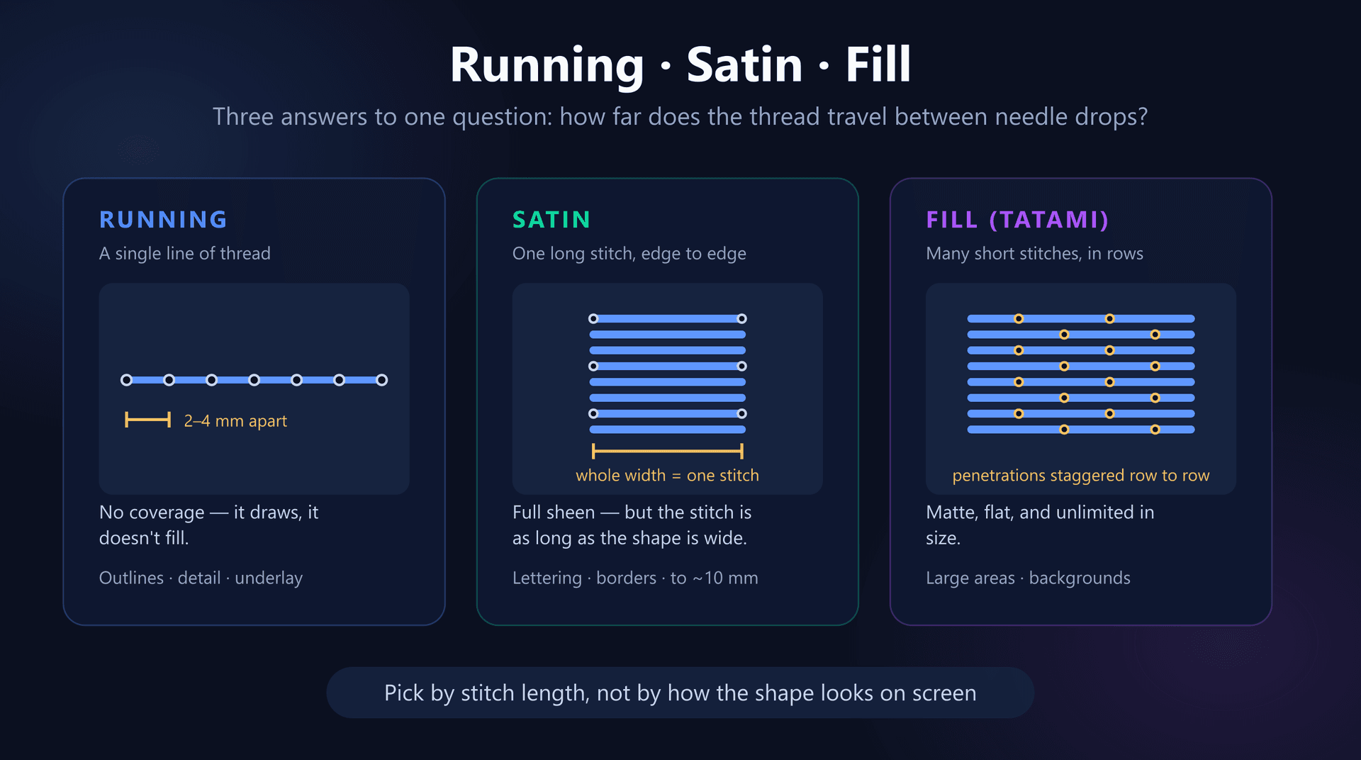
Every one of these three stitch types is an answer to a single question: how far does the thread travel between needle penetrations? Once you see them that way, the choice stops being a matter of taste and becomes something you can measure — and the failure modes at either end become predictable instead of mysterious.
The One Thing That Separates All Three
An embroidery machine can only do one thing: drive a needle through fabric, move, and drive it through again. Everything you see in a finished design is the consequence of where those penetrations land and how much thread lies between them.
A stitch that lies on the surface between two penetrations is called a float. A short float is locked down and safe. A long float has slack, sits proud of the fabric, and can be caught by a fingernail, a zip, or a washing machine drum. That single physical fact drives every rule in this article.
The three stitch types are three different bargains between coverage and float length:
- Running stitch — penetrations every 2–4 mm along a single path. Floats are short and safe, but a single line of thread covers no area at all.
- Satin stitch — one stitch spans the entire width of the shape, anchored only at the left and right edges. That single long float is what reflects light and gives satin its shine, and it is also its weakness.
- Fill (tatami) stitch — the area is covered by many short stitches in rows, with penetrations staggered between rows. Floats stay short at any size, so a fill can cover an area of any dimension safely.
Notice what that means: satin does not become risky because it's “the wrong stitch for a big shape”. It becomes risky because on a big shape, the individual stitch gets physically long. The stitch type never changed — the geometry did.
Running Stitch: A Line, Not a Fill
A running stitch is the simplest thing the machine can do — a line of stitches following a path, typically 2 to 4 mm apart. It lays down almost no thread, adds almost nothing to the stitch count, and covers nothing.
Use it where you want a mark rather than a mass:
- Outlines and detail lines — whiskers, veins in a leaf, panel lines, hand-drawn linework.
- Very small text, below roughly 5 mm letter height, where a satin column would be too narrow to stitch.
- Underlay — nearly all underlay is running stitch, laid down to anchor the fabric before the visible stitching goes on top.
- Travel between areas, where a well-placed run avoids a jump and a trim.
Its limitation is that it is one thread wide. If a running stitch looks too faint, digitizers often run it two or three times over the same path — a bean or triple stitch — which triples the apparent weight while keeping every float short. That is usually a better answer than trying to force a hairline satin column.
Satin Stitch: Sheen, at a Price
A satin stitch crosses the shape and back, over and over, so each individual stitch spans the full width of the column. Because every strand lies parallel and unbroken across the surface, light reflects off all of them in the same direction. That is the sheen — it is a geometric effect, not a special thread.
It is the right choice for lettering, borders, outlines with weight, and any small shape where you want the design to look raised and finished. And it stays the right choice for a surprisingly narrow band of widths.
Below about 1.5 mm it tears the fabric
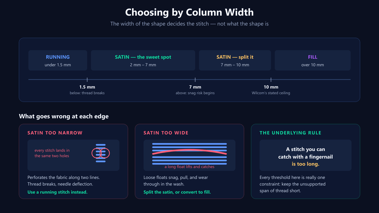
When a satin column gets very narrow, the left and right penetrations converge on the same two lines of holes. Instead of distributing needle punctures across an area, you are perforating the fabric twice along the length of the shape.
The symptoms are thread breaks, needle deflection, and in bad cases a column that literally tears its way out of lightweight fabric. Below roughly 1.5 mm, stop using satin and use a running stitch instead.
Above about 7 mm it starts to snag
At the other end, the float grows until it can be caught. This is where the numbers in different sources are worth reading carefully, because they are not in conflict — they mark different points on the same slope.
- 2 to 7 mm — the comfortable range. Nothing special required.
- About 7 mm — the point where many digitizers turn on auto-split, which breaks each long stitch into shorter segments and scatters the extra penetrations so they don't form a visible seam.
- 10 mm — Wilcom's recommended ceiling, and the figure most professional digitizers treat as the hard limit.
- Up to 15 mm — technically stitchable, described by Wilcom as carrying a high risk of snagging. Not a good idea on anything that will be worn or washed.
A useful field test needs no software at all: run a fingernail across the stitched sample. If it catches, the stitch is too long, whatever the number in the file said.
Density: start at 0.40 mm
Satin density is the gap between adjacent stitches, and 0.40 mm is the standard starting point. If the fabric shows through, tighten toward 0.38 mm. On knits and lightweight fabric, go the other way and open it up — packing needle holes close together on a stretchy fabric is one of the reliable ways to make a design pucker, which we cover in why satin stitches pucker on knit fabric.
Want a design where the stitch types are already chosen by column width?
Try the AI digitizerFill Stitch: Coverage Without a Size Limit
A fill — usually called tatami — covers an area with rows of short stitches. The critical detail is that the penetration points are offset from one row to the next. If they lined up, you would get visible channels running through the fill; staggering them scatters the holes so the surface reads as continuous.
Because the stitch length is set by the fill pattern rather than by the shape, a fill has no width limit. A 5 mm circle and a 150 mm background are stitched with the same length of thread between penetrations. That is the whole reason fill exists.
Typical starting values:
- Density around 0.40 mm, with 0.40–0.45 mm working well for most fabrics.
- Stitch length about 4 mm as a general default; 2.5–3.0 mm gives smoother results on curved or detailed shapes.
- An offset fraction near 0.25, meaning each row shifts its penetrations a quarter of a stitch relative to the row before.
The trade is appearance. A fill is matte and flat where satin is glossy and slightly raised, because the light hitting all those short stitches scatters instead of reflecting together. On a large shape that is usually what you want — a big satin area looks garish and stiff even when it stitches successfully.
Fills inside letters need an outline
If a letter is large enough that its strokes must be filled, the fill alone will leave a slightly ragged edge, because the row ends land at whatever points the fill pattern dictates. The standard fix is a narrow satin outline stitched around the filled letter, which gives the edge a clean, deliberate boundary.
Stitch Count, Time and Cost
Stitch type is also a cost decision, and the intuition most people have is backwards.
For a given area, satin is the heavier stitch. It lays a continuous surface of long strands, and converting a large satin shape to a fill will usually bring the stitch count — and therefore the run time and the thread bill — down. On a run of a few hundred garments that difference is real money.
For narrow shapes the comparison flips. A 3 mm satin column is cheaper and faster than trying to fill the same sliver, and it looks better. This is why the answer is always per-shape: the same logo can genuinely want all three stitch types, and choosing one for the whole design will cost you either quality or money.
If you want to see where a file's stitches are actually going, our free DST analyzer reports stitch count and density, and the DST viewer renders the real stitch paths so you can see which areas were digitized as satin and which as fill.
Which Survives the Wash
Durability follows float length just as closely as appearance does.
Fill is the most robust choice for large areas. Its stitches are short and frequently anchored, so there is very little thread standing proud of the fabric to catch on anything. A wide satin column is the most fragile, for exactly the opposite reason — long floats are the part of an embroidery most likely to be pulled.
Running stitch sits oddly in this comparison. Each stitch is short, so nothing snags, but it is a single line of thread with no redundancy: one broken stitch shows immediately, where a fill can lose a stitch without anyone noticing. On items that get heavy use, that argues for a bean stitch over a single run on any line that matters.
A Procedure You Can Actually Follow
Work shape by shape, not design by design. For each area in the design, in this order:
- 1. Measure the narrowest width of the shape, not its length. A long thin leaf is decided by its width.
- 2. Under 1.5 mm — running stitch, doubled or tripled if it needs more weight.
- 3. From 1.5 mm to about 7 mm — satin. This is the range it was made for.
- 4. From 7 mm to 10 mm — still satin, but turn on auto-split so no single float is over-long.
- 5. Over 10 mm — fill, or split the shape into narrower satin columns if the sheen genuinely matters to the design.
- 6. Tapering shapes — check the width at both ends. A shape that starts at 12 mm and tapers to 1 mm needs to change stitch type along its length, or be redrawn.
- 7. Add a satin outline around any filled shape whose edge needs to look crisp.
Then adjust for the fabric rather than the shape. Everything above assumes a stable woven. On knits, pile fabrics and anything that stretches, open the density and lean toward shorter floats than these numbers suggest.
What These Numbers Don't Tell You
Two honest caveats, because a table of thresholds can look more authoritative than it deserves to.
First, the width limits are guidance from digitizing software vendors, not physical constants. Wilcom says 10 mm; other digitizers work to 8 mm or push to 12 mm depending on the thread, the fabric and what the item is for. A patch that hangs on a wall can carry floats that would be destroyed on a child's sleeve.
Second, density values interact with everything else. A 0.40 mm satin on stable twill is not the same object as a 0.40 mm satin on jersey, and no number survives contact with an untested fabric. These are starting points for a test stitch-out, not settings to ship on.
Quick Reference
- All three types differ by one thing: how far thread travels between needle penetrations.
- Running — 2–4 mm penetrations, no coverage. Outlines, fine detail, small text, underlay.
- Satin — one stitch spans the shape. Sheen, slightly raised. Lettering and borders.
- Fill (tatami) — short stitches in staggered rows. Matte, flat, any size.
- Satin minimum: about 1.5 mm. Below that, run stitch.
- Satin comfortable range: 2–7 mm.
- Satin split point: about 7 mm. Satin ceiling: about 10 mm.
- Satin density: start at 0.40 mm; 0.38 mm for more coverage.
- Fill density: 0.40–0.45 mm, stitch length ~4 mm, offset ~0.25.
- Fill is usually cheaper than satin per unit of area, and more durable.
- Decide per shape, measuring the narrowest width — never per design.
Conclusion
Running, satin and fill are not three styles to pick between on taste. They are three ways of managing one variable — the length of thread lying unsupported on the surface — and the right choice falls out of the width of the shape in front of you.
Measure the narrowest part, apply the thresholds, and test on the real fabric. And if you would rather not make the call shape by shape, the EmbroidAI image-to-embroidery converter assigns stitch types by column width automatically, so the file you get back already respects the limits this article describes.
Frequently Asked Questions
What is the difference between running, satin and fill stitch?
They differ in how far the thread travels between needle penetrations. A running stitch is a single line of thread with penetrations every 2–4 mm; it draws a line but covers nothing. A satin stitch spans the full width of a shape in one stitch, anchored only at the two edges, which is what gives it its sheen. A fill (tatami) stitch covers an area with many short stitches in rows, with penetrations staggered from row to row, producing a flat matte surface. Coverage, sheen and durability all follow from that one difference.
How wide can a satin stitch be before you should use a fill?
Around 10 mm is the usual ceiling — Wilcom, whose limits most digitizers work to, recommends staying within it. Risk starts earlier than that: at about 7 mm the individual stitches are long enough to catch on things, which is why many digitizers enable auto-split at 7 mm. Up to roughly 15 mm is technically possible but carries a high risk of snagging. Past 10 mm, either split the satin into narrower columns or convert the shape to a fill.
What is the minimum width for a satin stitch?
About 1.5 mm. Below that, the two edges of the column are so close together that every stitch drops into effectively the same pair of holes, which perforates the fabric along two lines and causes thread breaks and needle deflection. Narrower than 1.5 mm, use a running stitch — sometimes doubled or tripled for weight — rather than trying to force a satin column.
What density should I use for satin and fill stitches?
For satin, 0.40 mm between stitches is the standard starting point; tighten toward 0.38 mm if the fabric shows through, and open it up on knits and lightweight fabric. For tatami fill, 0.40 mm is also typical, with 0.40–0.45 mm giving good results, and a stitch length of about 4 mm (some digitizers prefer 2.5–3.0 mm for smoother curves). These are starting values, not laws — always test on the actual fabric.
Does satin or fill stitch use more thread?
Per unit of area, satin is heavier. Satin lays a continuous surface of long stitches, while tatami covers the same area with shorter stitches at a similar spacing and typically produces a lower stitch count. That is why converting a large satin shape to a fill usually reduces both run time and thread cost. For narrow shapes the comparison reverses: a thin satin column is cheaper than filling the same sliver.
Which stitch type is most durable in the wash?
Fill stitch, on large areas. Its short stitches are anchored frequently, so there is very little unsupported thread to catch or abrade. A wide satin column is the most fragile choice because it leaves long floats that can be snagged and pulled. Running stitch is durable in the sense that it is short, but it is a single line — one broken stitch is visible immediately, with no neighbouring thread to hide it.
What stitch type should I use for small lettering?
Satin, down to about 5 mm letter height. Below that, the strokes of most letterforms fall under the 1.5 mm satin minimum and you should switch to a running stitch, accepting that the text will read as thin outlines rather than solid letters. Letters over roughly 20 mm can exceed the satin width limit in their thick strokes, at which point a fill with a satin outline gives a cleaner result.
Can I mix all three stitch types in one design?
Nearly every real design does. A typical logo uses fill for the large shapes, satin for the lettering and borders, and running stitch for fine detail and for the underlay beneath the other two. The stitch type is a per-shape decision, not a per-design one — pick it from the width of each individual area rather than from the design as a whole.