Tutorials
How to Prepare Designs for Polo Shirts
 By Varmil Kakadiya12 min read
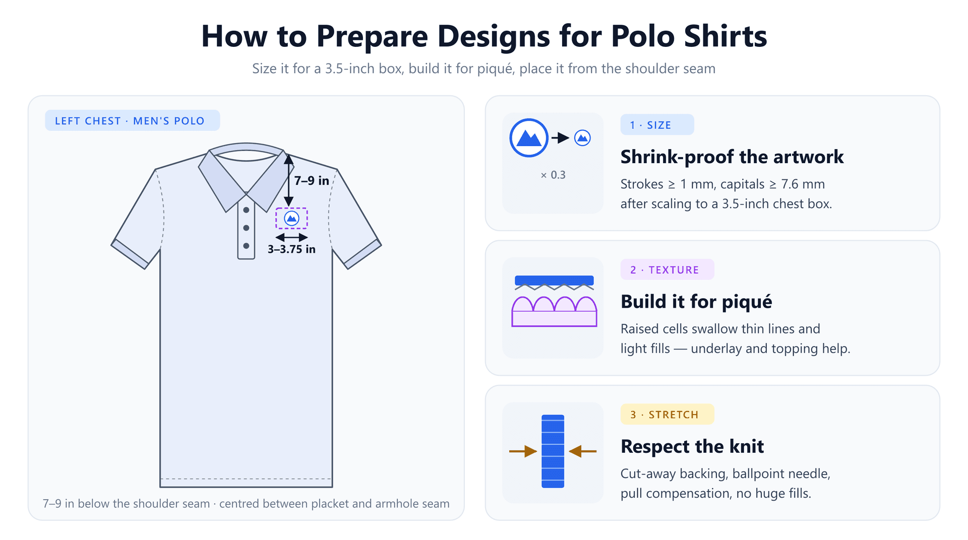
The logo looks great on the website. You send it off for forty staff polos, and the samples come back with a tagline that reads as a grey smudge, a circular border broken into dashes, and lettering that looks oddly swollen. The machine is fine and the digitizer did nothing unusual. The artwork was simply never prepared for the surface it landed on.
A polo is one of the least forgiving places to put a logo. It shrinks the design to roughly the width of a credit card, it has a textured knit surface that interferes with fine stitching, and it stretches. Each of those works against a different part of the design, and most of the damage is decided before anyone opens digitizing software.
This guide explains what each constraint does to a design, then walks through preparing artwork in order: size and placement, a simple shrink test for text and thin lines, colour and shape cleanup, the file settings that suit piqué, and the checks that catch problems before a full order is stitched.
Three Things a Polo Does to Your Design
It shrinks everything to about 3.5 inches
The standard polo logo sits on the left chest at 3 to 3.75 inches wide (76–95 mm). Most logos were drawn for something much larger: a sign, a website header, a letterhead. Scaling a 300 mm logo down to 89 mm multiplies every measurement in it by about 0.3.
On screen, that is harmless — pixels shrink with the image. Thread doesn't. A stitch has a physical thickness, and a satin column needs enough width for the needle to swing from one edge to the other and still read as a shape. Somewhere around 1 mm, a stroke stops being a column and becomes a single line of running stitches. Small letters cross the same threshold and lose their counters, serifs and spacing. Nothing about the original artwork warned you; the details were only ever too small at the size you're now asking for.
Piqué texture swallows fine detail
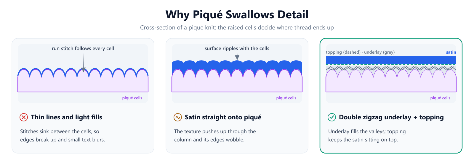
Most polos are knit in piqué, a cross-tuck knit that forms a surface of small raised cells. It is thicker and more stable than t-shirt jersey, which is good news for embroidery, but the texture is a problem for anything fine. Trade digitizers point out that piqué texture shows through top stitching more than it does on tees or twill.
The mechanism is easy to picture in cross-section. A run stitch or a light fill is laid directly on the fabric, so it follows the cells up and down. Seen from above, its edge wanders and its coverage is patchy. A satin column placed straight onto the knit fares better, but the cells still push up through it, and its edges ripple. What fixes it is a base: underlay that fills the valleys and gives the top stitches a flat deck to sit on.
It is still a knit, so it stretches
Piqué is firmer than jersey, but it is built from loops, and loops move. Every satin column pulls its two edges toward each other when the thread tightens, and a knit has less resistance to that pull than a woven fabric. On a polo, that shows up as gaps between outlines and fills, narrowed columns and, on lighter performance fabrics, puckering around dense areas. We covered the physics in detail in why satin stitches pucker on knit fabric; for design preparation, the takeaway is that large solid areas and very wide columns ask more of a polo than it can comfortably give.
Step 1: Decide the Size and Placement First
Every other decision depends on the final size, so settle it before touching the artwork. These are the ranges most decorators work to:
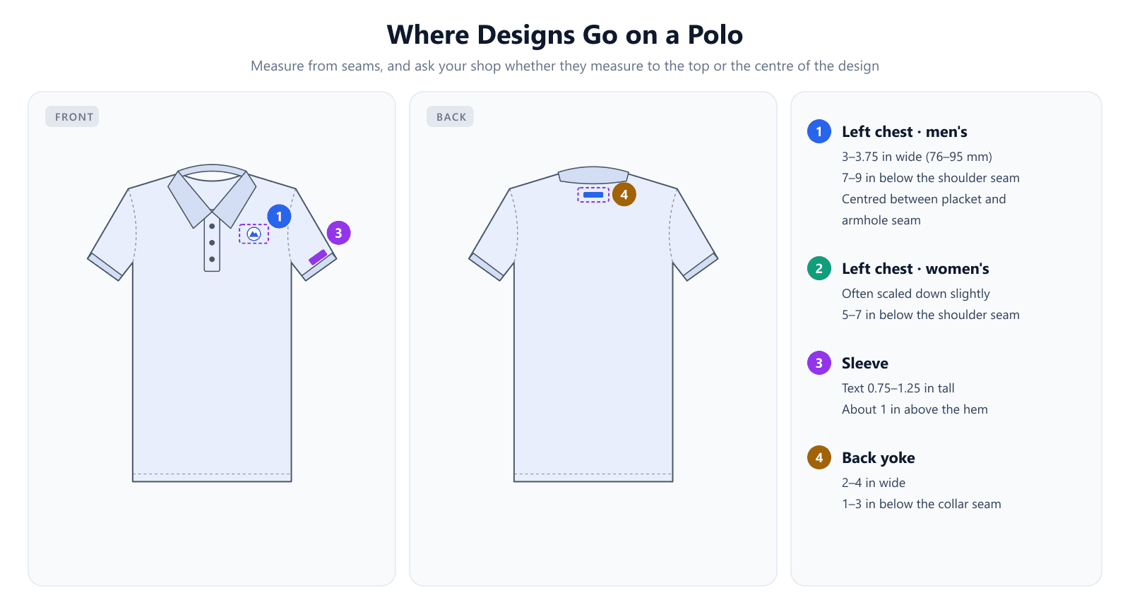
- Left chest, men's: 3 to 3.75 inches wide, 7 to 9 inches below the point where the shoulder seam meets the collar, centred between the placket and the armhole seam. Round or square emblems usually run a little smaller, around 2.5 to 3 inches.
- Left chest, women's: often scaled down slightly and placed higher, about 5 to 7 inches below the shoulder seam, because the cut is narrower and shorter in the body.
- Sleeve: text about 0.75 to 1.25 inches tall, roughly 1 inch above the sleeve hem, with a total area no larger than about 4 × 2 inches.
- Back yoke: 2 to 4 inches wide, 1 to 3 inches below the collar seam, centred.
Two details trip people up. First, measure from the shoulder seam, not the collar tip — the collar points vary by style and lie at different angles, so they make a poor reference. Second, shops differ on whether the 7–9 inch figure runs to the top or the centre of the design. On a 2-inch-tall logo, that difference is a full inch, so ask before you approve a placement.
Keep an eye on the placket too. The left chest area is bounded by the placket on one side and the armhole seam on the other, and the placket is several layers thick. A design that pushes much past 3.75 inches crowds that edge and makes the garment harder to hoop flat, which is one reason the standard size is what it is.
Step 2: Run the Shrink Test
Once you know the final width, work out what happens to the smallest details in the logo. The method takes two minutes: divide the final width by the artwork's width to get the scale factor, then multiply each critical measurement by it.
Take a logo drawn 300 mm wide going onto a 3.5-inch (89 mm) left chest. The factor is 89 ÷ 300 ≈ 0.3. Its 32 mm wordmark capitals become 9.5 mm — comfortably stitchable. Its 9 mm tagline capitals become 2.7 mm, and its 2.5 mm circular border becomes 0.74 mm. Both fall below what thread can reliably form, and both are exactly the failures in the opening example.
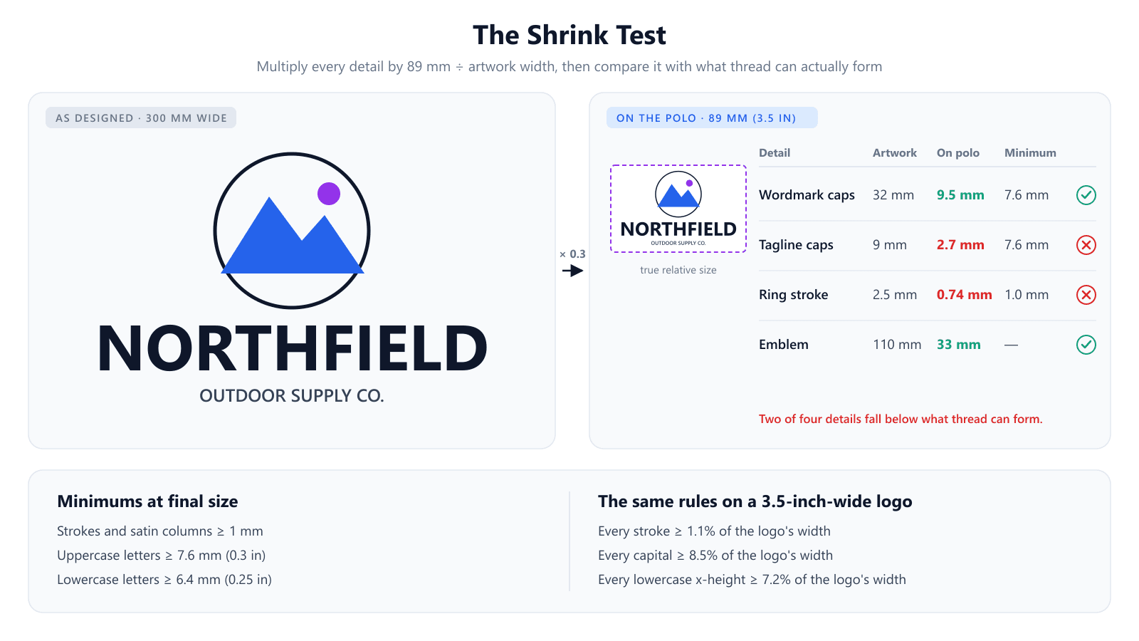
The minimums to check against, at final size, are widely used across the industry:
- Strokes and satin columns: at least 1 mm (about 0.05 inch).
- Uppercase letters: at least 7.6 mm (0.3 inch) tall.
- Lowercase letters: at least 6.4 mm (0.25 inch) tall.
For a 3.5-inch logo you can turn these into percentages and check the artwork directly without converting anything: every stroke should be at least 1.1% of the logo's total width, every capital at least 8.5%, and every lowercase x-height at least 7.2%. If your logo is 1,200 pixels wide, a stroke thinner than about 13 pixels will not survive.
Those are minimums for a smooth fabric. Because piqué texture eats into fine work, build in margin wherever the design allows. When a detail fails the test, you have three honest options: enlarge it, thicken it, or remove it. A tagline that can't reach 7.6 mm capitals usually belongs on the sleeve or the back yoke, or nowhere. A hairline border should be redrawn as a bold ring or dropped. What does not work is hoping the digitizer will find a way — they can only stitch what fits.
Lettering deserves its own look. Thin serifs vanish first, so a clean sans-serif or slab face holds up better at small sizes. Small closed counters — the holes in e, a and o — fill in when the stroke is heavy relative to the letter, so open the letter spacing slightly and avoid condensed weights.
Have a prepared logo ready to stitch? Turn it into a machine file with underlay and pull compensation already applied.
Try the AI digitizerStep 3: Simplify Colour and Shape
Passing the shrink test makes a design stitchable. These changes make it look intentional on a shirt.
Convert gradients and shading to flat colour
Thread comes in solid colours. A gradient has to be faked with blended stitches or bands of separate colours, and at left-chest size neither reads as a smooth transition — it reads as stripes or noise. Replace gradients with one flat colour, or two or three distinct tones if the shading carries meaning. Every additional colour also adds a thread change and usually extra trims, which lengthen run time and add places for the design to go wrong.
Remove the background box
A logo exported as a JPG almost always carries a white or coloured rectangle behind it. Left in, that rectangle gets digitized as a solid filled block — thousands of stitches forming a stiff patch on the chest. On a polo, the garment is the background. Prepare the artwork with a transparent background, or tell your digitizer explicitly that the box is not part of the design.
Prepare a version for each shirt colour
A navy wordmark on a navy polo disappears. Before an order, decide which thread colours go on which garment colours, and prepare a light-garment and a dark-garment version of the logo if the order covers both. Pay special attention to elements that rely on the background: a white shape inside a dark logo is often just a gap in the artwork, and on a coloured polo that gap will show the shirt colour instead of white unless it is stitched.
Avoid big solid areas
A large fill turns a soft knit into a stiff plate. It adds weight, blocks the fabric's drape, and — on lightweight performance polos especially — pulls the fabric into ripples around its edge. If a logo has a big solid shape, consider an outlined version, a lighter open fill, or splitting the shape into smaller sections. The same goes for satin columns: on knits, columns much over 4 mm wide pull hard and are better converted to fill. Our guide to running vs satin vs fill stitch explains which stitch suits which shape.
Step 4: Build the File for Piqué
These decisions belong to whoever digitizes the design, but knowing them helps you brief a digitizer properly and spot a file that was built for something else.
- Underlay on every column: edge run for clean edges plus zigzag for loft. On piqué, trade digitizers recommend stepping up to double zigzag where the column is wide enough, because it keeps the satin on top of the texture.
- Pull compensation: knits pull columns narrower than they were drawn, so the file should widen them slightly — up to about 0.4 mm on stretchier piqué.
- Satin width: keep columns under roughly 4 mm on knits and convert wider shapes to fill.
- Thread weight: 40 wt is standard. A 60 wt thread can render finer detail, but it needs a matching finer needle and covers less, so ask your shop before relying on it.
Density is where sources genuinely disagree, and both sides are right about different polos. On a classic cotton piqué, the texture is the main enemy, and digitizers suggest raising density slightly to cover it. On a lightweight polyester performance polo, the main enemy is puckering and perforation, and more stitches make it worse. Tell your digitizer which kind of polo the order is on; a single file built for one will be a compromise on the other. The types of underlay and stitch density guides go deeper on both settings.
Step 5: Match the Machine Setup
A well-prepared file still fails on the wrong setup. For polos, the standard combination is short:
- Stabilizer: a medium-weight cut-away (around 2.5–3.0 oz) for standard piqué; a no-show mesh cut-away for light, pale or performance polos. Not tear-away.
- Topping: a water-soluble film on top of piqué keeps stitches from sinking into the cells and sharpens column edges. It rinses out afterwards.
- Needle: a 75/11 ballpoint, which pushes the knit's loops aside instead of cutting them.
- Hooping: snug and flat, never stretched. A knit hooped under tension contracts after unhooping and puckers around the design.
The garment matters too. Cotton and cotton-rich piqué is the easiest base for embroidery; thin polyester performance fabric is the hardest. If you choose the polo, choosing a heavier piqué solves problems no file setting can.
Step 6: Check the File, Sew One, Wash It
Before stitching, open the machine file and look at it. Our free DST viewer renders the actual stitch paths, so you can see whether small text became running lines, and the DST analyzer reports the design's real dimensions, stitch count and colour changes, so you can confirm it is the size you asked for.
Then stitch one sample on the actual polo, in the actual colour, and wash and dry it the way a customer would. Knits relax in their first wash and the embroidery does not, so problems built into the hooping or backing often show up only then. One sample is cheap; forty reprinted polos are not.
What Fails Without Warning
A few mistakes don't look like mistakes until the shirts come back:
- Approving the design on screen at zoom. Print the logo at its real stitched size and hold it against a polo — that 30-second check catches most shrink-test failures.
- Using one file across different polos. A file tuned for cotton piqué can pucker on a polyester performance polo and look thin on a heavy jersey polo.
- Putting the men's file on women's polos. The logo is often too wide for the narrower chest and lands too low at the men's placement.
- Measuring placement from the collar tip. Collar styles vary; the shoulder seam doesn't.
- Leaving a background box in the artwork. It stitches, and it is very hard to unpick.
Polo Design Prep Checklist
- Confirm final size: 3–3.75 in wide for a men's left chest, a touch smaller for women's.
- Confirm placement and the reference point: 7–9 in below the shoulder seam (5–7 in for women's), top or centre of design.
- Run the shrink test: strokes ≥ 1 mm, capitals ≥ 7.6 mm, lowercase ≥ 6.4 mm at final size.
- Enlarge, thicken or remove anything that fails; move long taglines to a sleeve or yoke.
- Flatten gradients, cut colours to what the design needs, and delete the background box.
- Prepare light-garment and dark-garment versions where needed.
- Replace big solid areas with outlines or lighter fills; keep satin under ~4 mm.
- Brief the digitizer on the polo fabric: double zigzag underlay and pull compensation for piqué.
- Use medium cut-away or no-show mesh, a water-soluble topping and a 75/11 ballpoint.
- Check the file in a viewer, stitch one sample, and wash it before approving the order.
Conclusion
Preparing a design for a polo comes down to one idea: the shirt shrinks your logo to about 3.5 inches and then stitches it onto a textured, stretchy surface, so every detail has to be big enough, bold enough and simple enough to survive both. Decide the size first, run the shrink test, simplify colour and shape, and make sure the file is built for piqué.
Once the artwork is ready, the EmbroidAI image-to-embroidery converter turns it into a stitch file with underlay and pull compensation applied. For a name or a short line of text on the right chest or sleeve, the text-to-embroidery generator builds lettering directly at the size you set.
Frequently Asked Questions
What size should a left chest logo be on a polo shirt?
Most shops work to 3 to 3.75 inches wide (about 76–95 mm), with 3.5 inches the usual default. Square or round emblems are typically a little smaller, around 2.5 to 3 inches, because a wide mark of the same height would look oversized. Height follows from the logo's proportions; a horizontal logo usually ends up somewhere between 1 and 2.5 inches tall.
How far down from the collar should a polo logo be placed?
The common reference is not the collar but the shoulder seam where it meets the collar: 7 to 9 inches down on a men's polo and about 5 to 7 inches on a women's, centred between the placket and the armhole seam. Shops differ on whether they measure to the top or the centre of the design, so ask yours before you sign off on a placement.
What is the smallest text you can embroider on a polo?
Keep uppercase letters at least 7.6 mm (0.3 inch) tall and lowercase letters at least 6.4 mm (0.25 inch), with every stroke at least 1 mm thick at final size. Below that, letters are usually stitched as single running lines, and on piqué those lines sink into the knit's texture. Treat these as minimums for a smooth fabric and give yourself extra margin on a textured polo.
What stabilizer should I use for embroidering polo shirts?
Use a medium-weight cut-away, around 2.5 to 3.0 oz, for standard cotton or cotton-blend piqué. On lightweight, light-coloured or performance polyester polos, a no-show mesh cut-away gives permanent support without showing through. Avoid tear-away on polos: it is perforated by the needle exactly where the knit needs support, and what is left gets torn away after stitching.
Why does my logo look blurry on a piqué polo?
Piqué has a raised, cellular surface. Thin running stitches and light fills follow that surface down into the gaps between the cells, so their edges break up and small text loses its shape. The fix is partly in the artwork (thicker strokes, larger text) and partly in the file: double zigzag underlay to build a flat base, slightly more coverage, and a water-soluble topping during stitching.
Can I embroider a detailed or photographic logo on a polo?
Not at left-chest size without simplifying it. Gradients, photographic shading and hairline details have no thread equivalent at 3.5 inches wide. Prepare a simplified embroidery version of the logo with flat colours, merged small shapes and thicker lines, and keep the detailed version for print and screen use.
Should women's polos use the same logo file as men's?
Usually they need a slightly smaller version and a higher placement. Women's polos are cut narrower across the chest, so a logo sized for a men's shirt can crowd the placket or sit too close to the armhole, and the men's 7–9 inch drop puts it too low. Many shops keep a second, scaled-down version of the logo for ladies' cuts.
Does a polo logo go on the left or right chest?
The wearer's left chest is the standard spot for a primary logo on a polo. The right chest is commonly used for a secondary element such as a person's name, a certification mark or a second logo, and the same sizing and shrink-test rules apply there.