Embroidery Basics
How Does Auto Digitizing Work? Inside the Image-to-Stitch Pipeline
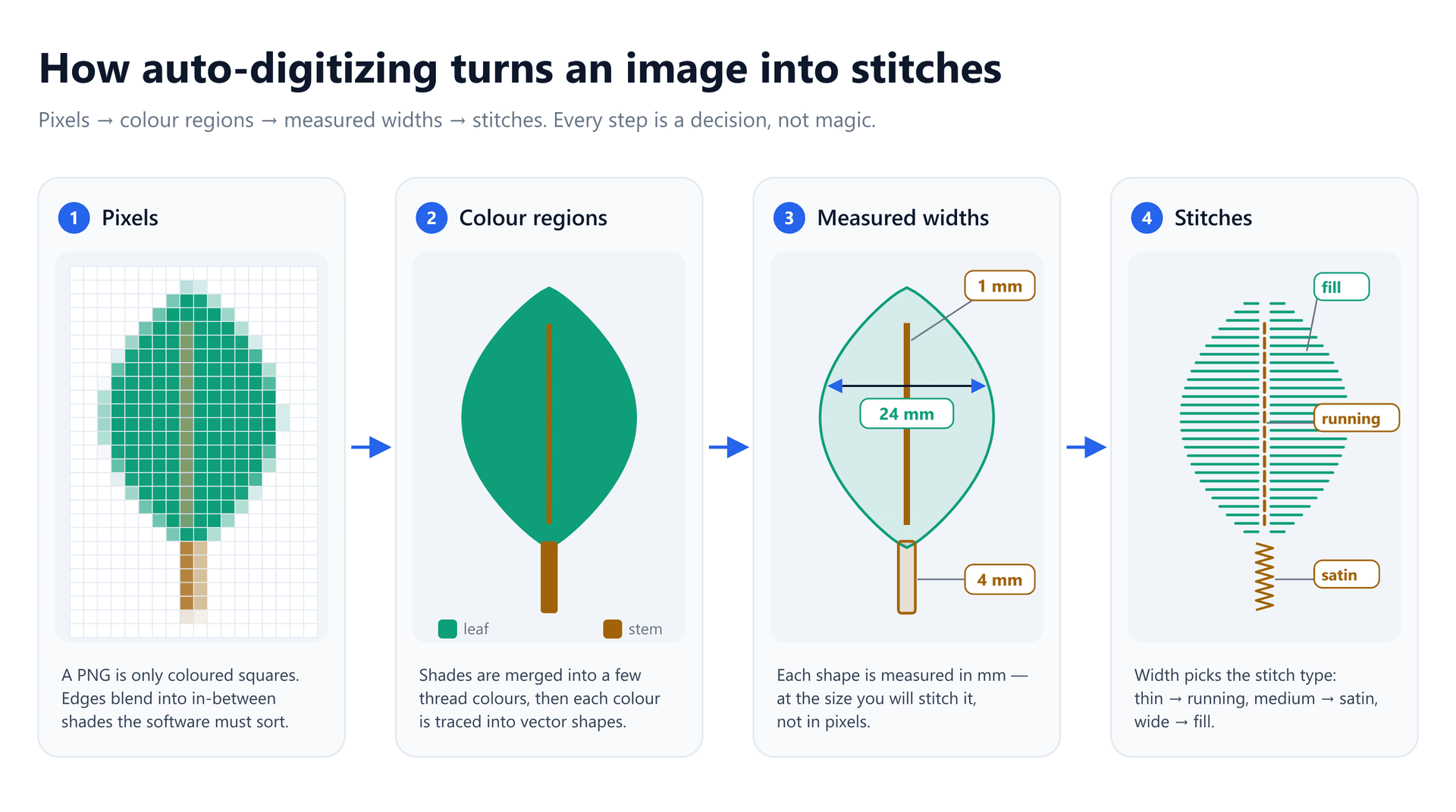
You upload a logo, press a button, and twenty seconds later you have a stitch file. You run it. The big shapes look great, but a faint ring of a second blue appears around every letter, the thin outline has vanished, and the tagline has turned into a row of lumps. Then you stitch the same file at twice the size and most of those problems disappear. Nothing about the software changed — so what did?
Auto digitizing feels like one magic step, but it is really a chain of six small decisions. Each one is made by a fixed rule, using only what the software can measure from your image. Once you know what those rules look at, the odd results stop being random. You can predict them, and in most cases you can prevent them by changing the image rather than fighting the stitch file.
This guide walks through each stage, the numbers behind it, where it tends to break, and how to prepare artwork so the software guesses right the first time.
What Auto Digitizing Actually Has to Do
An image and an embroidery file have almost nothing in common. A PNG is a grid of coloured squares. A machine file such as a DST contains no colours and no shapes at all — just a long list of needle movements, each a few millimetres long, with commands mixed in for jumps, trims and colour changes.
Getting from one to the other is what digitizers have always done by hand, a craft still called punching. A human looks at a shape and decides its stitch type, angle, density, underlay and the order it should sew in. Auto digitizing replaces every one of those judgements with a rule. The rules are sensible defaults — Wilcom's own documentation describes its stitch type and direction choices as reasonable but “not always optimal” — and they only ever see what is in the pixels.
The Six Stages of the Pipeline
Every auto-digitizer, from desktop suites to browser tools, works through roughly the same sequence. The names differ; the jobs do not.
1. Find the background and drop it
Most logos sit on a white or transparent backdrop. To a computer that backdrop is just another colour region — the largest one in the image. If it is not removed, the software will dutifully fill the entire hoop with white thread. Tools detect it from the alpha channel when the PNG is transparent, or by sampling the colour along the image border when it is not.
This is the first place a cheap input fix pays off. A transparent PNG removes all guesswork. A white logo on a white background, on the other hand, gives the software no way to tell artwork from backdrop.
2. Reduce the colours to threads
This is the stage that surprises people most. A logo you think of as two colours may contain dozens. Smooth edges are drawn with anti-aliasing: pixels on the boundary are blended between the two colours so the curve looks smooth on screen. JPEG compression adds its own faint blocky shades on top. Count every distinct value and a simple blue shape on white can easily return sixteen colours.
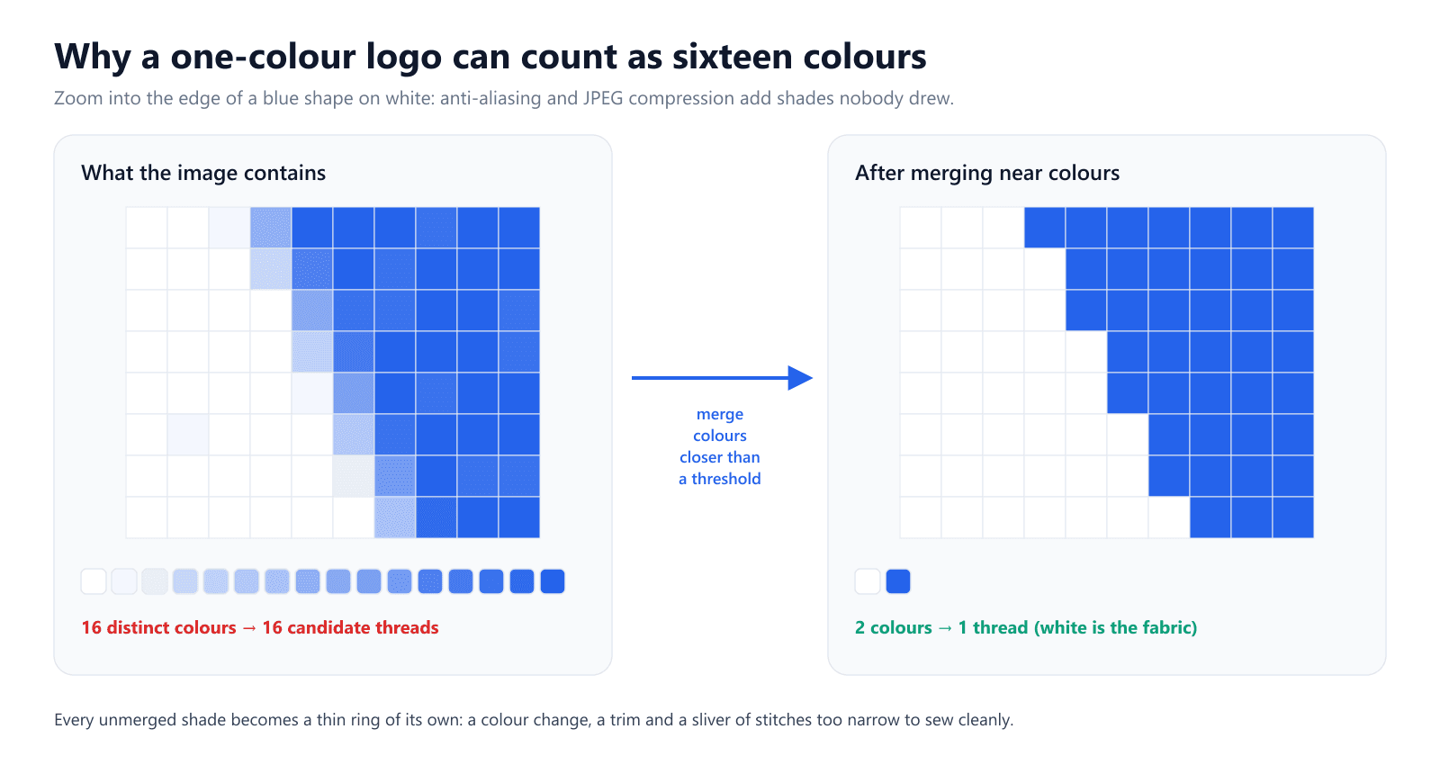
Colour reduction fixes this by clustering similar colours and snapping every pixel to the nearest survivor. Two settings control it: a merge distance, below which two colours count as the same thread, and a capon the total. Wilcom's instant auto-digitizing targets five or six colours; EmbroidAI caps a design at 15 threads, matching the needle count of a common commercial head, and folds the least-used colours into their nearest neighbour above that.
A speckle filter runs alongside, discarding patches too small to stitch — a few pixels of stray noise, or a region covering less than a tiny fraction of the image. Get this stage wrong in one direction and you get ghost rings and dozens of colour changes. Get it wrong in the other and two genuinely different colours, such as a navy and a royal blue, collapse into one.
Gradients are where this stage struggles most. A smooth fade has no natural break, so reduction cuts it into three or four hard-edged bands, each of which becomes its own object.
3. Trace each colour into vector shapes
With colours settled, each colour region is traced into a vector outline. The tracer walks the boundary pixel by pixel, then fits smooth curves through it, deciding at each bend whether it is a sharp corner or part of a curve. This step is what turns jagged pixel staircases into clean shapes that a needle can follow.
It is also where resolution shows. A curve drawn with only a handful of pixels gives the tracer too few points to fit, so it either wobbles or flattens into straight segments. Hatch's guidance is to scan artwork at 600 DPI rather than the 96 DPI many images are saved at, for exactly this reason. If you already have vector art, a SVG-to-DST conversion skips stages 1–3 entirely, because the shapes and colours are already explicit.
4. Measure every shape in millimetres
This is the stage most explanations skip, and it is the one that decides how your design will actually sew. Stitch choices depend on physical width, but an image only has pixels. A 40 px stroke has no width until you say how big the finished design is.
So the software first scales the shapes to your design size — usually the hoop or the width you type in — and then measures each one. A common technique is to thin the shape down to a one-pixel centre line, its skeleton, and record the distance from that line to the edge. Twice that distance is the local width. A leaf body might measure 24 mm across, its stem 4 mm and its vein 1 mm.
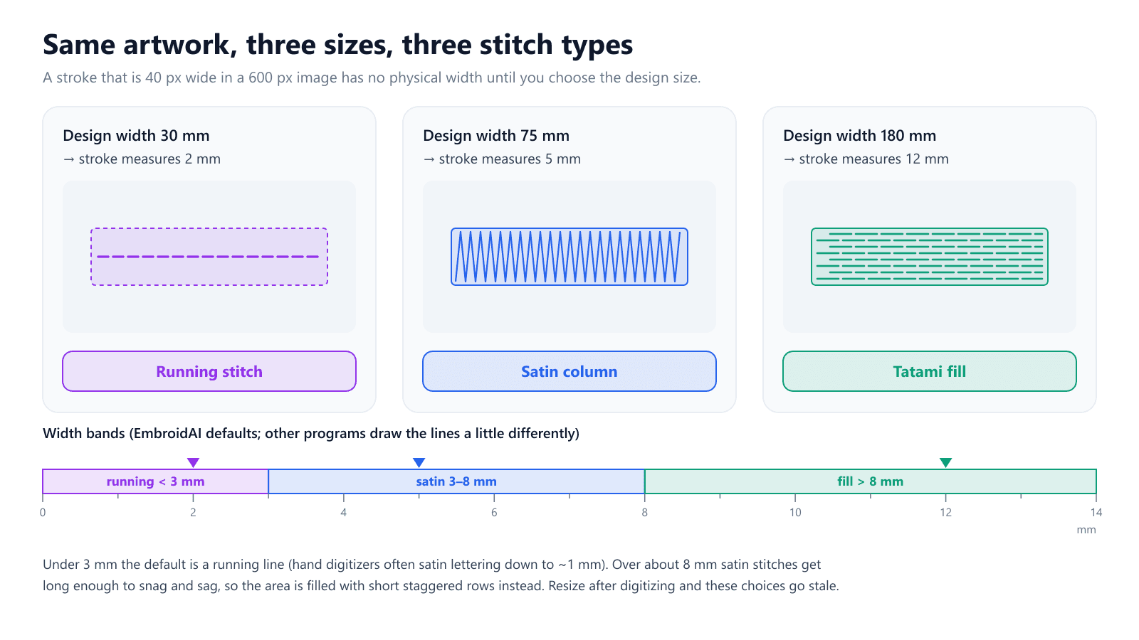
The practical consequence is large. Set the size before you digitize, not after. A finished stitch file that is scaled up by 50% keeps its old decisions: a 6 mm satin becomes a 9 mm satin that is now too long to lie flat. Scale it down and fills pack too densely while thin strokes shrink below anything a needle can form.
Want to see these stages on your own artwork? Pick a hoop size first and watch the stitch types follow.
Try the AI digitizer5. Assign stitch types and settings
With a width for every shape, the stitch choice is a lookup. The exact cut-offs vary by program, but the shape of the rule is universal:
- Narrow lines become running stitch. EmbroidAI's default boundary is 3 mm; hand digitizers will often push satin down to about 1 mm for lettering, but no automatic rule can safely assume that.
- Medium widths become satin columns — stitches laid side by side across the shape, which give the glossy look of a lettered patch. EmbroidAI uses satin from 3 to 8 mm; most guidance caps satin somewhere between 7 and 10 mm.
- Wide areas become tatami fill: rows of short, staggered stitches that spread tension across the shape instead of laying one long thread across it.
Each type then gets default parameters. Fills are usually laid at a 45° angle, because rows that run with the weave sink into it and show as stripes. Row spacing sits roughly between 0.25 and 0.45 mm depending on the program and fabric. Many tools also add underlay and a pull compensation value, which widens shapes slightly so they finish at the right size after the thread draws the fabric in. These are where auto results are weakest: the same angle on every fill looks flat, and a single compensation value cannot suit both a cap and a stretchy polo. Our comparison of running vs satin vs fill stitch covers what each type is good for in more depth.
6. Sequence the objects and write the file
Finally the software decides the order. Objects are grouped by colour so each thread is sewn once, then ordered within each colour to keep travel short. Every gap between objects becomes a jump; long jumps get a trim first so a loose thread isn't dragged across the design (EmbroidAI trims any move longer than 5 mm). Good ordering is a craft of its own, covered in our guide to embroidery pathing.
The last step encodes all of this in the machine's format. Formats impose their own limits: a single DST record can move the needle at most 12.1 mm in each direction, so any longer move is split into several jumps. This is pure bookkeeping, but it is why two files with the same design can report different stitch counts.
Where Auto Digitizing Goes Wrong — and Which Stage Did It
Almost every disappointing auto-digitized design traces back to one of the stages above. Matching the symptom to the stage tells you what to change.
- Ghost outlines, extra colour changes, dozens of trims — colour reduction kept anti-aliasing or JPEG noise as real colours (stage 2).
- Wobbly or lumpy edges — the image was too small or blurry for the tracer to fit clean curves (stage 3).
- Thin lines missing or turned into a single running line — at your chosen size they measured under the satin threshold (stage 4).
- Small text that fills in — letter strokes fell below about 1 mm and the gaps inside letters closed up (stages 4 and 5).
- Stripy, banded shading — a gradient was cut into a few flat colour bands (stage 2).
- Flat, lifeless fills — every area received the same default angle (stage 5).
- Puckering around dense areas — default density and compensation did not suit the fabric (stage 5).
The common thread: the software is not misreading your image. It is reading it exactly, and the image contains information you did not mean to send.
How to Prepare an Image So the Software Guesses Right
Each step below costs nothing and fixes a specific stage. Work through them in order before you upload.
Decide the finished size first
Know whether this is a 60 mm chest logo or a 250 mm jacket back before you start, because that number drives every stitch choice. Measure the thinnest line and the smallest letter at that size: if a stroke is under 1 mm or text is under about 6–7 mm tall, thicken or enlarge it in the artwork now.
Give it enough pixels
A useful target is 10 pixels per millimetre of finished design, so roughly 1,000 px across for a 100 mm logo. The reasoning is simple: a 1 mm line drawn only three pixels wide can be measured as anything from 0.7 to 1.3 mm, which is the difference between a satin and a running stitch. Ten pixels per millimetre keeps that error small.
Flatten the colours yourself
Replace gradients with flat fills, remove drop shadows and glows, and reduce the palette to the threads you actually intend to use. Save as PNG rather than JPG so compression doesn't add noise, and use a transparent background where you can. The cleaner the colours going in, the less the reduction stage has to guess.
Handle text separately
Traced lettering is the hardest case for any auto-digitizer, since small letters are made almost entirely of thin strokes. Where you can, remove text from the image and add it with a tool that stitches from real font outlines, such as a text-to-embroidery generator. The letters then come out as proper satin columns rather than traced approximations.
Auto vs Manual: An Honest Split
Auto digitizing is excellent at bold logos, icons, mascots and clip art with flat colours and clear shapes. For those it produces a usable file in seconds, which also makes it ideal for previews, stitch-count estimates and quick quotes.
It is weakest exactly where a digitizer's judgement matters most: very small lettering, photo-style shading, stitch directions chosen to suggest texture or light, and designs for difficult fabrics such as fleece or stretchy knits. Cleaning up a complex auto-digitized file can take longer than digitizing it by hand, so for that kind of work the honest answer is still a human.
Check the File Before You Stitch
Whichever way the file was made, look at it before you commit fabric. Our free DST viewer draws the real stitch paths, so missing outlines and unexpected colour stops are obvious at a glance. The DST analyzer reports stitch, jump and trim counts — a design with far more trims than colours is a sign that stage 2 kept noise as colour.
Quick Auto-Digitizing Checklist
- Choose the finished size before digitizing, and never scale a finished stitch file by more than a few percent.
- Supply at least 10 px per mm of finished design (≈1,000 px for 100 mm).
- Use PNG with a transparent background rather than JPG.
- Flatten gradients, shadows and glows into solid colours.
- Limit the palette to the threads you plan to use.
- Make every stroke at least 1 mm wide at the final size.
- Keep text at least 6–7 mm tall, or add it from a font instead.
- Preview the stitch paths and check trim counts before sewing.
- Test on the real fabric — auto defaults don't know your garment.
Conclusion
Auto digitizing is a measurement pipeline: it reduces your image to a few colours, traces them, measures every shape in millimetres at the size you chose, and lets those widths pick the stitches. Nearly every bad result comes from feeding it information you didn't intend — stray shades, too few pixels, or the wrong size.
Give it clean, flat, correctly sized artwork and it will do in seconds what used to take an afternoon. To try it on your own design, upload a PNG to the EmbroidAI image-to-embroidery converter, choose your hoop, and inspect the result before you stitch. For a step-by-step walkthrough of that workflow, see how to convert PNG to DST.
Frequently Asked Questions
How does auto digitizing software decide between satin and fill stitch?
It measures how wide each shape is in millimetres at the size you plan to stitch, then applies a width rule. In EmbroidAI's defaults, anything under 3 mm becomes a running line, 3–8 mm becomes a satin column, and anything wider than 8 mm becomes a tatami fill. Other programs use slightly different cut-offs, but every auto-digitizer makes this decision from width, which is why the design size you choose matters so much.
Why does my auto-digitized design have so many colour changes?
The software found more distinct colours in the image than you can see. Anti-aliased edges and JPEG compression create dozens of in-between shades, and if those are not merged into their neighbours each one becomes its own thread, with a colour change, a trim and a thin sliver of stitches. Flatten the artwork to the exact colours you want before uploading, or lower the colour count in the tool.
What image resolution is best for auto digitizing?
Aim for at least 10 pixels per millimetre of finished design — about 1,000 px across for a 100 mm logo. The software has to measure widths from pixels, and a 1 mm line drawn only 3–4 pixels wide cannot be measured accurately. More pixels than that rarely hurts, while a small, blurry image almost always produces wobbly outlines and extra objects.
Can you auto digitize a photo?
You can, but the results are rarely good. A photo has smooth gradients and thousands of colours, and colour reduction turns each gradient into three or four hard-edged bands that read as posterized rather than shaded. Photo-realistic embroidery needs blended fills and deliberate stitch angles, which is still manual work. Bold logos, icons and clip art with flat colours are what auto digitizing does well.
Is auto digitizing as good as manual digitizing?
For clean, flat artwork it gets close, and it is far faster — seconds instead of hours. For small lettering, textured stitch directions, photo-style shading or fabrics that pucker easily, a skilled digitizer still produces a better file, because those choices depend on judgement the software replaces with fixed defaults. Many shops use auto digitizing for a first pass and then edit the result.
Why did my design stitch badly after I resized it?
Stitch types, density and compensation were all chosen for the original size. Scale a design up 50% and a 6 mm satin becomes a 9 mm satin that is now too long to lie flat; scale it down and fills become too dense and small text closes up. Re-run the auto digitizer at the new size instead of stretching a finished stitch file.
What is the smallest text auto digitizing can handle?
As a rule of thumb, keep text at least 6–7 mm tall (about 1/4 inch) and every letter stroke at least 0.8–1 mm wide at the finished size. Below that, strokes fall under the satin threshold and turn into thin running lines, and the counters inside letters like 'e' and 'a' fill in. For anything smaller, use a text tool that stitches from real font outlines rather than tracing pixels.
Should I upload a PNG or a JPG for auto digitizing?
PNG, whenever you have it. PNG is lossless and can carry a transparent background, so edges stay sharp and the backdrop is easy to drop. JPG compression adds faint blocky noise around every edge, which shows up as extra colours and ragged outlines. If a JPG is all you have, export it at a large size and flatten the colours before uploading.